

Airbnb+ Service Enhancement
Millions of travelers worldwide choose Airbnb for their accommodations, yet many face challenges such as uncertain cleanliness standards and difficulty procuring essentials in unfamiliar locations. To address these issues, I have designed two innovative services.
By prioritizing convenience and peace of mind, these services reduce common pain points for guests while showcasing how thoughtful design can transform the hospitality experience.
SKILLS
Design Research
Sketching
Brainstorm
Wireframing
TOOLS
Figma
Procreate
PROJECT DURATION
Dec 2024 - Jan 2023
Prototyping
Sketching
User Testing
User Flow Diagram
Service Blueprint
UI/UX Design
To improve the Airbnb guest experience, this project introduces two service solutions directly addressing common pain points. A disposable essentials kit ensures hygiene confidence upon check-in, while a pre-arrival grocery ordering system simplifies the first-day shopping experience. Both services integrate seamlessly into the existing Airbnb platform, enhancing guest convenience, building trust, and elevating overall satisfaction.
Introduction
While Airbnb offers flexible and diverse accommodations for millions of travelers, guests often encounter two common challenges: uncertainty about the cleanliness of linens, surfaces, and amenities; and the difficulty of purchasing groceries or daily necessities upon arrival, especially in unfamiliar locations or remote areas.
These issues can create unnecessary stress, disrupt the guest experience, and lead to reduced overall satisfaction with the stay.
Problems


“How might we create service solutions that ensure a cleaner, more convenient, and more welcoming experience for Airbnb guests from the moment they arrive?”

About Airbnb+
This project aims to improve Airbnb’s guest experience by introducing two targeted service solutions.
For hygiene concerns, I designed a Disposable Essentials Package, offering guests the option to order single-use items such as bed sheets, pillow covers, towels, slippers, and personal care products during the booking process. These items are delivered and prepared before check-in, giving guests peace of mind about cleanliness without burdening hosts with extra preparation.
To address grocery challenges, I developed a Pre-Arrival Grocery Ordering System integrated into the Airbnb app. Guests can browse curated grocery packages or customize their orders prior to arrival. The groceries are delivered and stocked in the property before the guest checks in, eliminating the need to search for nearby stores or carry heavy bags upon arrival.
Design Process
*
Design Process *
Researching Gesture
In the initial research phase, I focus on observing both intentional and unintentional gestures in individuals, using video recordings of conversations.
This study shows that gestures are often subtle and overlooked, but they vary widely and align with the content and tone of speech, thus improving communication clarity. Recognizing that the variety and subtlety of gestures can enhance technological interfaces and make them more intuitive.

Based on the discovery that gestures are diverse and often align with verbal content and emotional states, the designed gestures for the app should be universally understandable and applicable to all users.

Exploring Gesture
My goal was to interact with the application using precise and visually understandable gestures.
However, as I progressed, I realized that some gestures that seemed clear to me might not be easily understood by the audience. This realization prompted me to adjust my approach.


How I decided on the chosen gestures:
In the process of finding an appropriate gesture for each specific function, I initially created different gestures for various functions based on my own ideas. I designed them in 3 different styles and presented them as animations to my friends. By testing and gathering feedback.

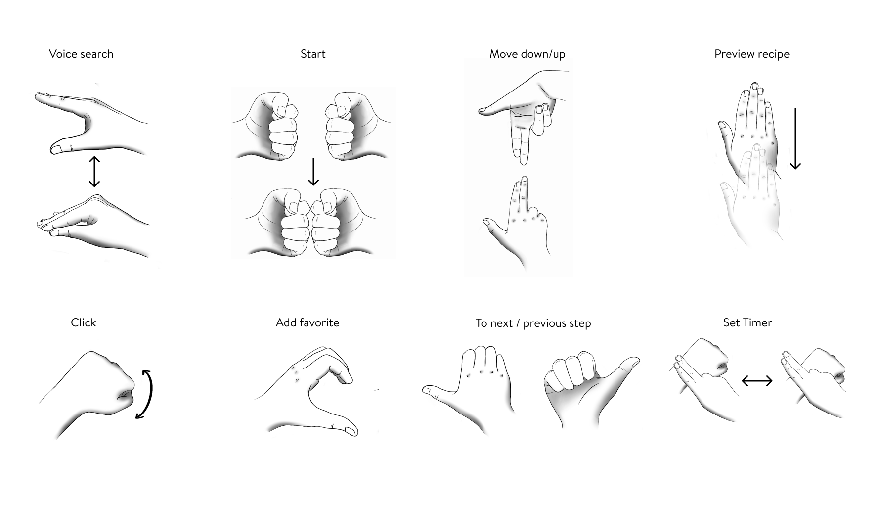
Final Gesture List
How I tested the gestures to find out:
During gesture testing, I asked friends as subjects to see if they could understand and mimic gestures based on animations. This helped identify which gestures were intuitive and easy to replicate.
The final gesture design for CookTrails was refined to be universally recognizable and straightforward, avoiding complex or subtle movements. This process identified clear, effective gestures, making them more user-friendly and understandable.

Design Feedback
Feedback is crucial for any interactive system or product and holds particular significance in gestural interface design.
Feedback reduces user uncertainty in interactive systems and provides real-time responses to user gestures, allowing users to see the system's tracking and understand their actions. This helps in recalibrating gestures for accuracy and boosting confidence.
Echo Feedback:
Echo feedback reflects unprocessed sensor data back to users. It shows that the system acknowledges user interaction, aiding in calibration. An example is a mouse cursor movement mirroring hand motion without activating interface elements.
Semantic Feedback:
This involves processed data providing visual, auditory, or tactile feedback, indicating successful action completion. For example, a button changing color upon being tapped signals recognition of the action by the system.

Initial Feedback
CookTrails Initial Feedback Model:
A pop-up appears at the bottom of the screen when the user's hand enters the operational range.
Icons move synchronously with the detected gesture (Echo feedback).
An icon indicates correct/successful gesture recognition, with the UI changing accordingly (Semantic feedback).
The popup disappears after the operation.
Final Feedback
CookTrails Final Feedback Model:
Upon hand detection in the operational range, the feedback shows the user's specific location on the page (Echo feedback).
The system monitors the user's gestures, with the UI changing based on the function of the gesture (Semantic feedback).

User Flow Diagramming
A User Flow diagram is a visual guide showing the steps a user takes in a digital interface, like a website or app. It helps me to plan and streamline the user's journey, highlighting the sequence of interactions and potential issues, and ensuring intuitive navigation.

Task Flow 1
Add Recipe to Favorites

Task Flow 2
Set a Timer

Task Flow 3
Watch Recipe Instructions

Task Flow 4
Looking For a Specific Recipe

Task Flow 5
Record by Take a Photo
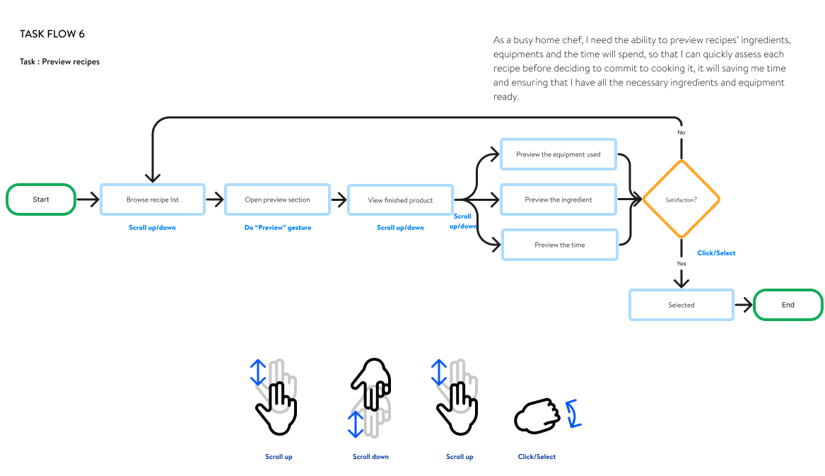
Task Flow 6
Preview Recipes
Each user flow is treated as a distinct functional task. Special attention is given to annotating the involved gestures in the flow design, ensuring that suitable user interface components are created for each key interactive element.

Wireframes & Screens
In designing the core user interface of CookTrails, I began with foundational UI research.
This involved studying and integrating UI patterns from a variety of existing apps, and analyzing the strengths and weaknesses of each page design.
From this research, I started with mid-fidelity wireframes, progressively enriching and refining the design details to create a professional and user-friendly interface.

UI Patterns - Research

Mid-Fidelity Wireframes
Mid-Fidelity Wireframes
Mid-fidelity wireframes help me visualize the basic layout and functionality of the user interface. It's a crucial step for refining design concepts and understanding user interactions, allowing for early adjustments.

Final Screens

User Testing
User testing is vital for UX designers to validate design choices and ensure a user-centric product. It helps identify issues for improvement. A testing script is important for structured testing, outlining tasks, and maintaining consistency.

Script:
I am currently developing a gesture-controlled recipe app, and I'd like to show you the prototype. First, take a look at this page. I will then provide you with a scenario. You will be using this application as a user of this software. The scenario is as follows: You have downloaded a contactless recipe app. You need to learn the gestures along with the tutorials in the software, so you should try to perform each gesture after it has been taught in order to operate the software.
Questions:
Do you think the tutorials are clear enough for learning the gestures?
Did the app provide sufficient feedback or cues to ensure you were performing the gestures correctly?
Were the gestures easy to perform and remember? If not, which specific gestures were challenging?
What were your overall thoughts and feelings about the gesture-controlled recipe app?
Can you identify areas that you think could be improved?
Anything else you'd like to add or share?


Notes From Testing
Main takeaways:
Gestures: Adjust the color of a partial gesture when two gestures appear at the same time.
"Select" Gestures: Adjust the motion track animation in the tutorial section.
Arrows in the gesture animation section should change color to make this section stand out more.
Adjust the ”preview” animation to make the preview part smoother.
Add a page for users seeking KuKu for gesture help, including all gesture guides.

Brand Style Guide
The final phase in developing the CookTrails concept involves creating its style guide. This process consolidates the product's aesthetic into a unified visual identity, shaping its overall look and feel.

When creating the style guide for this application, I aimed to ensure harmony and comfort in the design and overall user interface. To achieve this, I developed several different color palettes and tested their usage in various primary frames within the app. This method allowed me to determine which color palette best suited specific interfaces. I opted for Brandon Text to maintain consistency and readability throughout the entire application.
Final Thoughts
This project delved into the design of a gesture-based interface, emphasizing user testing and feedback for refinement. By analyzing gestures, it highlighted cultural, linguistic, and emotional variations crucial for a universally intuitive app. A style guide ensured design consistency, while green screen technology underlined the importance of visual storytelling and lighting. The project showcased the advantages of gesture interaction for enhancing digital engagement, leading to a more immersive user experience. The final design combines visual appeal with user-friendly tutorials, and a detailed video with a backstory, underscoring a deep understanding of design principles and user engagement.